Daily reports become 'the language of management,' not a list of tasks
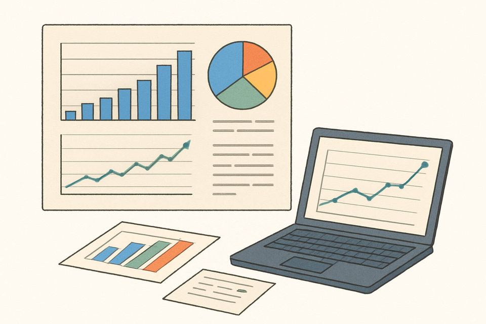
The 'dashboarding of management indicators' is underway to make the daily reports written by each department, including Minish Technology, Minish Dental Hospital, and Minish Institute of Technology, intuitively understandable through numbers and graphs. Until now, the reports created by the departments were either in a confusing format or merely transferred raw data, making it difficult to understand the overall flow.
This isn't just about organizing numbers. It's about creating a "language of management" that goes beyond reporting and into understanding and insight. Visualized graphs, tables, and numbers give you an at-a-glance view of each team's management metrics. It's not about what you've done, it's about where you are in the process.
The first thing you'll notice is the ad spend dashboard, which was created by the content team. It organizes ad spend metrics by medium, content, and time period. The dashboard was created by Bae Young, the team leader, using Google's Rocker Studio. Other departments are also trying to visualize the Excel data that they used to aggregate daily.
This shift isn't just about introducing a technical form of visualization, it's about changing the way we think about what we're communicating and for whom.
Your report shouldn't be a piecemeal list of your work, but rather a description of your work in relation to key performance indicators (KPIs). Make sure that the flow is clear even for someone who doesn't know your work.
"Dashboards are made to be understood by others or superiors, so images, colors, placement, and even text size should be designed in a way that helps them understand," said Kang Jeong-ho, CEO of Minish Technology, adding, "A summary of the contents should be placed in the front, followed by detailed descriptions and important contents in batches."
This dashboarding effort is about making the way we work clearer and more transparent. In this time of emergency, we need to think every minute about what we can say in numbers.
Get new stories from Minish in your inbox.
Check your inbox and confirm your subscription.
Something went wrong. Please try again.